A unique initiative led by the Prime Minister’s Office to promote lifelong learning and personal development. Being led by a highly esteemed government agency, required a strong and credible brand identity to reflect its authority and leadership.
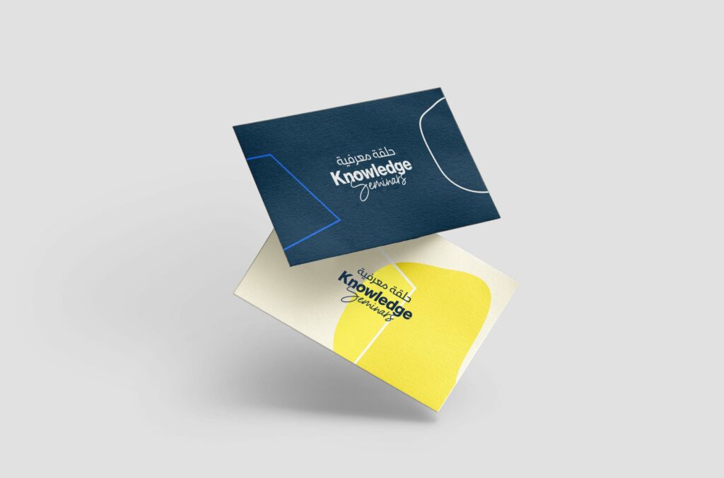
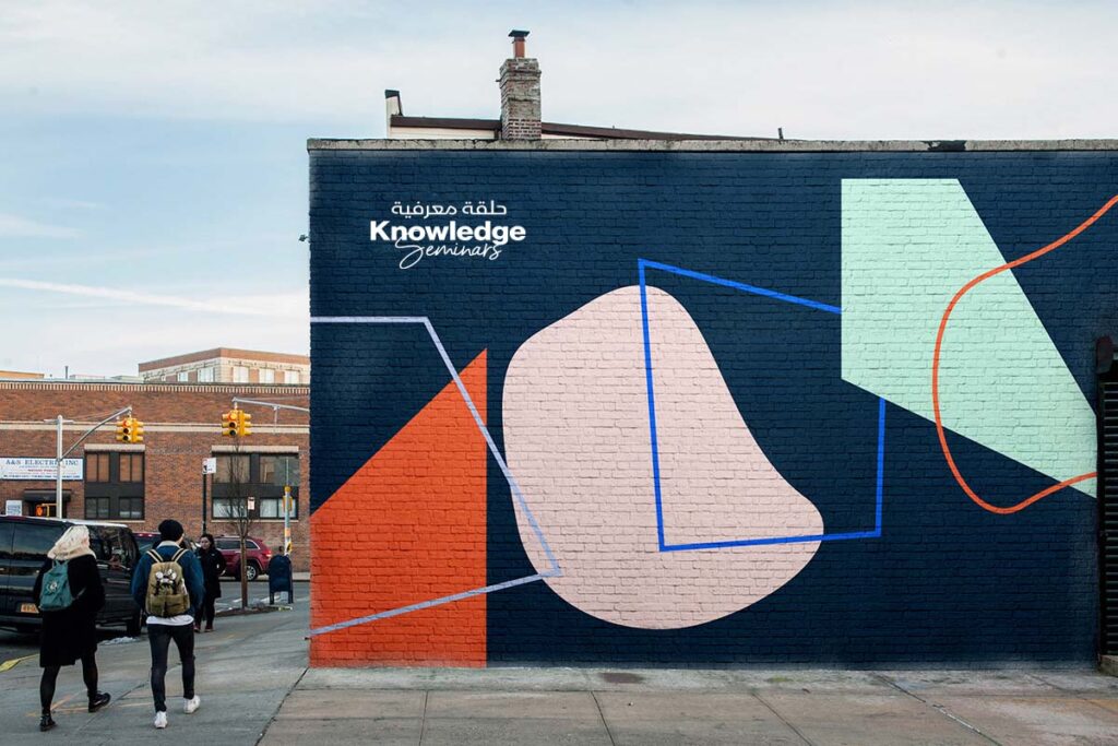
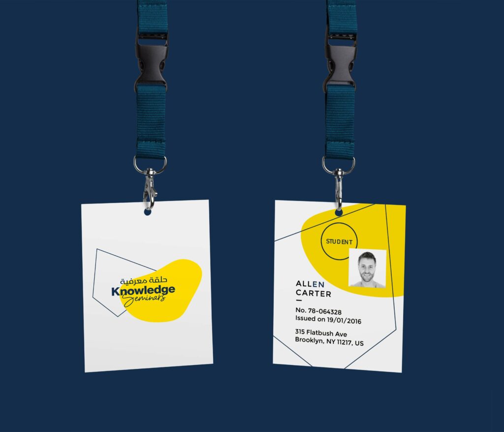
The creative branding strategy for “The Knowledge Seminars” started with a clear understanding of its core values and mission. The brand messaging was supposed to convey a sense of confidence, trustworthiness, and responsibility, while also being approachable and accessible. Visual elements such as the logo, color palette, and typography were chosen carefully to reflect the office’s authority and professionalism.
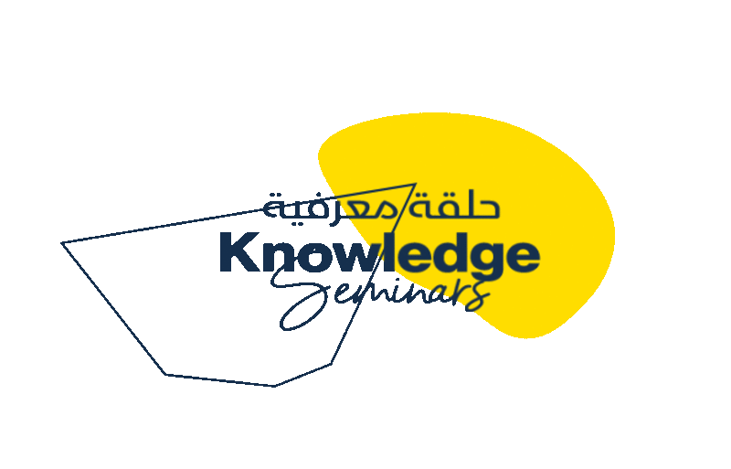
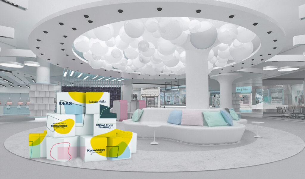
After conducting research and brainstorming sessions, we came up with the idea of using the color yellow for the logo. Yellow is associated with optimism, creativity, and energy. It perfectly captures the essence of the brand and the exciting learning experience that “The Knowledge Seminars” provides.
We also incorporated a moving part and a non-moving part into the logo design. The moving part symbolizes the fluidity and creativity of the mind, while the non-moving part represents the stability and structure required for scientific inquiry and logical reasoning.
This duality represents the two sides of the brain – the left and the right – and how they work together to create a balance between creativity and rational thinking.
The moving part is designed to resemble a thought bubble or a burst of inspiration. It’s meant to convey the idea that learning is an exciting and dynamic process that constantly evolves and inspires new ideas.
On the other hand, the non-moving part of the logo is designed to look like a solid block, representing the foundation of scientific knowledge upon which the creative mind can build.
Project
The Knowledge Seminars
Client
Prime Minister Office
What We Did
Branding, & Design